Your website needs a menu navigation.
But you want to keep the design minimal and modern. So what do you do?
The solution is pretty elegant and simple.
You simply move the menu off the screen until your users want it. When they want it they click a button and the menu shows up.
Like this:
Click the menu in the top left corner
You'll see the off-canvas menu slide onto the page.
So, how do you create this? And how hard is it?
It's surprisingly easy.
Up until earlier this year I always accomplished this purely in CSS. Kind of like the example above.
That was until I was going through one of the best Vanilla Javascript courses I've taken called Learn Javascript by Zell Liew.
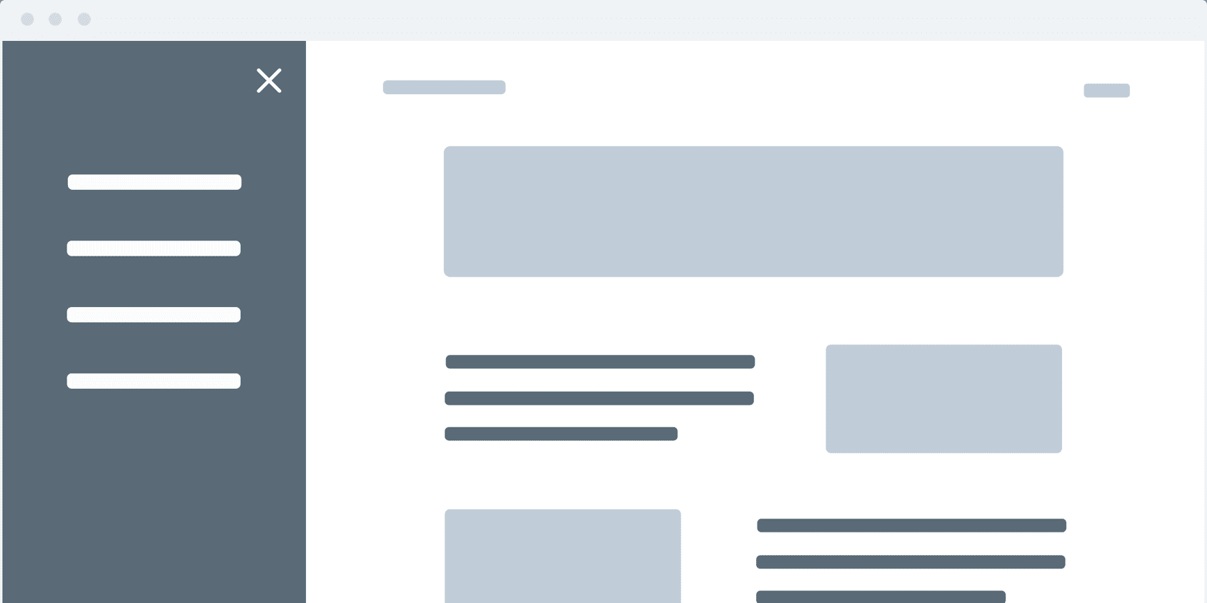
One of the course projects is an off-canvas menu that looks like this:
Click the button to open the sidebar!
Today I'm going to walk you through exactly how to style this off-canvas menu directly from the Learn Javascript course. If you're a Learn Javascript student, I'm going to walk you through the CSS so you know exactly what's happening.
Let's recreate Zell's off-canvas menu
There are three parts: the HTML, the CSS, and the JavaScript.
First, let's walk through the HTML:
html1<!DOCTYPE html>2<html lang="en">3 <head>4 <meta charset="UTF-8" />5 <meta http-equiv="X-UA-Compatible" content="IE=edge" />6 <meta name="viewport" content="width=device-width, initial-scale=1" />78 <title>Off-canvas menu</title>910 <link11 href="https://fonts.googleapis.com/css?family=Roboto:400,700"12 rel="stylesheet"13 />14 <link rel="stylesheet" href="css/normalize.css" />15 <link rel="stylesheet" href="css/reset.css" />16 <link rel="stylesheet" href="css/styles.css" />17 </head>1819 <body>20 <div className="offsite-container">21 <nav className="nav">22 <ul>23 <li><a href="#">Home</a></li>24 <li><a href="#">Work</a></li>25 <li><a href="#">About</a></li>26 <li><a href="#">Contact</a></li>27 </ul>28 </nav>29 </div>3031 <div className="site-container">32 <h1>Click the button to open the sidebar!</h1>33 <button>34 <span>Menu</span>35 </button>36 </div>3738 <script src="js/main.js"></script>39 </body>40</html>
Most of this is straightforward. You can see the first div on line 20 has an offsite-container class that wraps the off-canvas menu. After that is the site-container class on line 31 that wraps the body of the page.
Now let's look at the Javascript:
js1const button = document.querySelector("button")2const body = document.body34button.addEventListener("click", _ => {5 body.classList.toggle("offsite-is-open")6})
What we're doing here is simply adding an event listener on the button so that when the button is clicked a class of offsite-is-open is added or removed to the body tag. We'll use that class to open and close the menu using CSS.
Now let's dive into fully understanding the CSS.
Step 1 - First, let's lay the foundation
Current resets
You may have noticed when you browsed through the HTML that a normalize and reset stylesheet were added:

The normalize.css file is a CSS file that you can drop onto a website or a project and it will give you a more consistent experience across browsers. Forms, buttons, and headlines, for example, will appear more consistent from Safari to Firefox to Chrome.
The reset.css file removes the built-in browser styling. For instance, it might set all elements to have 0 padding and 0 margin.
If you're not super comfortable with CSS or you're simply creating a mini project like this one and want to put something together quickly, using Normalize and/or a CSS Reset is totally fine. In general though I'd recommend:
- only use styles on your website that you know what they're doing
- don't add more lines of CSS than you actually need (which is hard to do when you use someone else's styles that you don't know what they're doing).
When you download the off-canvas project files from The Learn Javascript Course here's what you'll see on the stylesheet:
css1:root {2 --textColor: #031129;3 --backgroundColor: #41b89a;4 --menuTextColor: #9ebed0;5 --menuTextHoverColor: #eaf0f3;6 --menuBackgroundColor: #031129;7}89html {10 font-size: 125%;11 font-family: "Roboto", sans-serif;12 line-height: 1.4;13}1415body {16 background-color: var(--backgroundColor);17 color: var(--textColor);18}1920h1 {21 margin-top: 3rem;22 margin-bottom: 1rem;23 font-weight: 400;24 line-height: 1.25;25}2627/*28 * BEGIN EDITING FROM THIS POINT ONWARDS29 * =====================================30 */3132/**33 * Containers34 */35.offsite-container {36 position: fixed;37 top: 0;38 bottom: 0;39 left: -14rem;40 width: 14rem;41 background-color: var(--menuBackgroundColor);42 transition: transform 0.3s ease-out;43}4445.offsite-is-open .site-container,46.offsite-is-open .offsite-container {47 transform: translateX(14rem);48}4950.site-container {51 padding-top: 3rem;52 padding-left: 2.5rem;53 max-width: 33rem;54 transition: transform 0.3s ease-out;55}5657/**58 * Menu button59 */60button {61 border: 2px solid currentColor;62 transition: background-color 0.3s ease-out;63}6465button:hover,66button:focus,67.offsite-is-open button {68 background-color: var(--textColor);69 color: var(--backgroundColor);70 border-color: var(--textColor);71}7273/**74 * Navigation75 * -----------76 */77.nav {78 margin-top: 6rem;79}8081.nav a {82 display: block;83 margin: 0;84 padding: 0.5rem 3rem;85 color: var(--menuTextColor);86 text-decoration: none;87}8889.nav a:hover {90 background-color: #010b13;91}9293.nav a:hover,94.nav a:focus,95.nav a:active {96 color: var(--menuTextHoverColor);97}
:root
The :root on line 1 is a pseudo class that refers to the root element of the CSS tree. Essentially it represents the html selector, except the :root has a higher specificity.
What this means is that:
- The
:rootstyles will be available everywhere on your page so you can use them on any element. - The
:rootstyles will override any conflicting styles that are placed on thehtml(because of their higher specificity).
css1:root {2 --textColor: #031129;3 --backgroundColor: #41b89a;4 --menuTextColor: #9ebed0;5 --menuTextHoverColor: #eaf0f3;6 --menuBackgroundColor: #031129;7}
All that is happening here is that a number of colors will become available via Custom Properties (aka CSS Variables). We're not using them yet, this is simply assigning a text color, background color, and so on.
Custom Properties are great. Here are two quick reasons why I like using Custom Properties:
First, they will be really useful to keep you from repeating yourself as you write your CSS. For instance, if you want to change the text color you can do it once here at the root and it will update everywhere the variable is used.
Second, they provide meaning and clarity to your CSS. For example, #031129 doesn't really suggest a color - it's just some random numbers. But, --textColor does have meaning.
HTML
css1html {2 font-size: 125%;3 font-family: "Roboto", sans-serif;4 line-height: 1.4;5}
This project has very little text and elements and so the font-size: 125%; on line 2 makes everything larger and easier to work with.
On line 3 you can see that the font we're using is Roboto. If you look back to the HTML you'll see where Roboto was included (via Google Fonts) into this project in two weights:
- 400 which is a regular font weight
- 700 which is a bold weight
html1<link2 href="https://fonts.googleapis.com/css?family=Roboto:400,700"3 rel="stylesheet"4/>
Now, all you need to do is assign the font family as Roboto, which is exactly what we're doing here.
On line 4, the last style we're assigning to the page is line height. Basically line height sets the distance between lines of text. It's kind of like line spacing in a text document. For example, if you double spaced the text in a text document the equivelent of that in CSS is: line-height: 2;.
Since the line-height is being assigned to the html element all text styles will inherit this line height. It's kind of like the starting point that you can keep or customize on any specific element.
Body
css1body {2 background-color: var(--backgroundColor);3 color: var(--textColor);4}
This is the first use of the Custom Properties that were assigned in the :root element. The background is going to use the --backgroundColor and the text is going to use the --textColor. Just like with line-height, the color of the text throughout this page will have a starting point of --textColor that you can keep or customize on any specific element.
Step 2 - Minimal Page Design
With those general styles in place this is what the page looks like:

And here's what it will look like when we're done:

Let's review the styles that impact the design of the page.
H1
css1h1 {2 margin-top: 3rem;3 margin-bottom: 1rem;4 font-weight: 400;5 line-height: 1.25;6}
The top margin (line 2) is pushing the content a little lower on the page. And the bottom margin (line 3) is giving the headline a little space between the text and the button. They're both using rem which is a relative size based on the root element's (which is the <html>) font size.
Using rem (or other relative units like em) is good practice for accessibility as well since it respects any changes the users might make to the default font sizing in their browser.
Because we have two font weights: 400 and 700, line 4 is explicitly stating that the <h1> will have a regular font weight.
On line 5, the base line-height of 1.4 is being overridden. So, now the line-height will be 1.25.
Important Note About This CSS
Here we are using a margin-top and margin-bottom. This is how we've always done it.
However, we're living in a global world. People will be reading your page in different languages.
In order to account for that, CSS has rolled out some updates - a few of which are still in the works. Part of that effort is something called logical properties. It is a new way to ensure your web design can handle when text is read from right to left (i.e. arabic) and/or top to bottom (i.e. japanese).
Instead of using
margin-topthe logical property would bemargin-block-startand instead of usingmargin-bottomthe logical property would bemargin-block-end.Learn more about logical properties and other new ways to ensure your website can be read in any language.
.site-container
css1.site-container {2 padding-top: 3rem;3 padding-left: 2.5rem;4 max-width: 33rem;5 transition: transform 0.3s ease-out;6}
The .site-container is a div that wraps the content of the page.
The padding on lines 2 and 3 give the page a little bit of space on the top and the left (the logical property for this would be padding-block-start and padding-inline-start - if this is confusing to you get the Logical Properties guide. It will make it all very clear.
On line 4 the page is set to have a max-width (the Logical Property for this is max-inline-size) of 33rem so it can't go any larger than 33rem's but it can go smaller on smaller screens.
On line 5 the transition is applied only to any transforms that are applied to the .site-container. The transition makes the transform happen in a smooth movement (over the span of .3 second) instead of instantaneously. Without the transition the menu would open abruptly.
The transition happens via the css here:
css1.offsite-is-open .site-container,2.offsite-is-open .offsite-container {3 transform: translateX(14rem);4}
When the button is clicked the .offsite-is-open class is added to the page via javascript (see javascript above). And that activates the transform.
The transform property can do a number of different things. In this case it's translating both the body and the navigation along the x axis (left and right). This is what is opening and closing the off-canvas menu.
button
css1button {2 border: 2px solid currentColor;3 transition: background-color 0.3s ease-out;4}
Although there are only two lines of CSS for the button, the reset.css has given the button a little bit of padding and it also made the background color of the button transparent. That's why there's no color in the background.
On line 2 the border is set to be 2px wide with a solid line type. The border color of the button is currentColor which will inherit the color of the parent element. However, in this case the parent element doesn't have a color assigned. So, when this happens the color defaults to black. currentColor and Custom Properties are slightly different, particularly in how they inherit colors. So be aware when you use them.
When the off-site nav is open or when the button is hovered over or is focused on these styles will be applied:
css1button:hover,2button:focus,3.offsite-is-open button {4 background-color: var(--textColor);5 color: var(--backgroundColor);6 border-color: var(--textColor);7}
Have you been styling your hover, focus, and active states with the same CSS?
Yeah, I'm guilty of this too. Each of these states are different though and should be styled differently, especially when you take into consideration accessibility.
The background (line 4) and border (line 6) color of the button is turned to the dark text color and the color of the text is turned to teal color of the page background.
Because of the transition set on the button, the background color does a very smooth change from a transparent background to a text color background when hovered over.
With these styles in place this is how our page is looking so far:

And when the menu button is clicked:

All that is left is to style the menu.
Step 3 - Create a beautiful menu
.offsite-container
css1.offsite-container {2 position: fixed;3 top: 0;4 bottom: 0;5 left: -14rem;6 width: 14rem;7 background-color: var(--menuBackgroundColor);8 transition: transform 0.3s ease-out;9}
The menu is set to a position fixed (on line 2). This page doesn't have much content but even if there was enough content to scroll, the menu would remain in the same fixed position.
The top (line 3) and bottom (line 4) are set to 0 position which means the menu will stretch from the top of the page to the bottom of the page. Similarly the width (line 6) of the menu is set to be 14rems wide.
By default we want the menu to be hidden. Hence, the left assignment of -14rem (line 5) which is how wide it is. So, it is just off the screen.
The background color (line 7) is set using one of the custom properties that were assigned on the :root element.
On line 8 the transition is the same as the .site-container and follows the same logic.
nav
css1.nav {2 margin-top: 6rem;3}
The navigation is moved slightly down from the top of the page to line up with the page headline (do you know what the logical property for this would be?..).

a
Now, the final piece is to style the navigation menu items:
css1.nav a {2 display: block;3 margin: 0;4 padding: 0.5rem 3rem;5 color: var(--menuTextColor);6 text-decoration: none;7}
By default link's are inline elements. By changing them to a block level element (line 2) you can control the padding or margin above and below the links. This also allows the link to stretch the whole width of its container. This is handy if you're adding a background color behind the links or a border.
On line 4 the links are given a 0.5rem padding on the top and bottom and 3rem padding on the left and right, which will make them look a lot better with more white space around them.
The color is assigned to be the menu text color on line 5.
And the text-decoration set to none on line 6 removes the underline beneath the links.
When you hover over the menu items the background and text color change:
css1.nav a:hover {2 background-color: #010b13;3}4.nav a:hover,5.nav a:focus,6.nav a:active {7 color: var(--menuTextHoverColor);8}
And the color of the text turns to the text hover color. Now you have a beautiful off-canvas menu.
Click the button to open the sidebar!
Step 4a - Two minor button details to consider
At this point your menu looks really beautiful and the animation is silky smooth. There are two very small adjustments I'd recommend.
Button focus can look bad
When you click on the menu button to open and close the menu navigation you'll see a small outline around the button. Can you see the white outline around this button when it's clicked:

This can be fixed by adding an outline: none; on the button.
Button and Cursor UX
When you hover over the button notice how the cursor doesn't change:

This was intentional on Zell's part. There are a lot of people who believe that buttons shouldn't have hand cursors when you hover.
You should determine which direction you would like to go on this topic.
I may be on the wrong side of the argument and at some point might change my mind but for now I believe that changing the cursor to a pointer when hovering over a link or a button is good UX.
Yes, I know it won't change the user's behavior. When you see the button you'll still click it regardless of the cursor.
However, it may make you question for just a second. And I personally want users experience on my website to be smooth and effortless. The cursor is a very, very tiny part of that experience. But it is part of it. And I care about that.
So, if you want to change the cursor by making it a hand on hover your button CSS should look like this now:
css1button {2 border: 2px solid currentColor;3 transition: background-color 0.3s ease-out;4 outline: none;5 cursor: pointer;6}
With that change here's how the button looks now:

Step 4b - Two minor navigation link details to consider
Since the off-canvas menu is kind of the hero of this project I want to show you two lines of CSS that can make a big difference in their interaction.
Have I mentioned I love transitions?
I do.
I love transitions.
They can make the interface feel so much more polished and they're so easy.
So, let's add a transition to the links. But first, I want to show you a before and after. Here's the navigation before a simple transition. Open the offsite navigation and hover over the links:
Click the button to open the sidebar!
Now add a simple transition to the navigation links on line 7:
css1.nav a {2 display: block;3 margin: 0;4 padding: 0.5rem 3rem;5 color: var(--menuTextColor);6 text-decoration: none;7 transition: all 0.3s ease-out;8}
I'm adding a transition to all elements because I want the background color, the text color and the next line of CSS I'm going to mention to all transition.
From a UX perspective the feedback to the user on hover is still not extremely clear. There's a color change, but I recommend a little more interaction. Let's move the navigation over a bit so there's a bit of movement on hover.
css1.nav a:hover {2 background-color: #010b13;3 padding-left: 3.5rem;4}
Earlier these links were given a left and right padding of 3rem's. Now we're saying let's move it over .5rem's more (3rem to 3.5rem) but only when we're hovering over the link. Here's how the navigation looks now:
Click the button to open the sidebar!
With these changes your CSS stylesheet should look like this:
css1:root {2 --textColor: #031129;3 --backgroundColor: #41b89a;4 --menuTextColor: #9ebed0;5 --menuTextHoverColor: #eaf0f3;6 --menuBackgroundColor: #031129;7}89html {10 font-size: 125%;11 font-family: "Roboto", sans-serif;12 line-height: 1.4;13}1415body {16 background-color: var(--backgroundColor);17 color: var(--textColor);18}1920h1 {21 margin-top: 3rem;22 margin-bottom: 1rem;23 font-weight: 400;24 line-height: 1.25;25}2627/*28 * BEGIN EDITING FROM THIS POINT ONWARDS29 * =====================================30 */3132/**33 * Containers34 */35.offsite-container {36 position: fixed;37 top: 0;38 bottom: 0;39 left: -14rem;40 width: 14rem;41 background-color: var(--menuBackgroundColor);42 transition: transform 0.3s ease-out;43}4445.offsite-is-open .site-container,46.offsite-is-open .offsite-container {47 transform: translateX(14rem);48}4950.site-container {51 padding-top: 3rem;52 padding-left: 2.5rem;53 max-width: 33rem;54 transition: transform 0.3s ease-out;55}5657/**58 * Menu button59 */60button {61 border: 2px solid currentColor;62 transition: background-color 0.3s ease-out;63 outline: none;64 cursor: pointer;65}6667button:hover,68button:focus,69.offsite-is-open button {70 background-color: var(--textColor);71 color: var(--backgroundColor);72 border-color: var(--textColor);73}7475/**76 * Navigation77 * -----------78 */79.nav {80 margin-top: 6rem;81}8283.nav a {84 display: block;85 margin: 0;86 padding: 0.5rem 3rem;87 color: var(--menuTextColor);88 text-decoration: none;89 transition: all 0.3s ease-out;90}9192.nav a:hover {93 background-color: #010b13;94 padding-left: 3.5rem;95}9697.nav a:hover,98.nav a:focus,99.nav a:active {100 color: var(--menuTextHoverColor);101}
Customize your off-canvas menu
You should now understand every line of CSS for this surprisingly simple off-canvas menu. Take the CSS above and customize your very own off-canvas menu for your website.
If you're interested in learning Vanilla Javascript I highly recommend the Learn Javascript Course.
Try your hand at Logical Properties
Want to learn how to adjust the CSS for this off-site menu to use Logical Properties?
I've got you covered.
Sign up to get access to learn the ins and outs of Logical Properties, including how well each of the properties are supported by browsers (hint: it's really good). Plus much more!