For a long time I wanted to learn CSS. Like really learn it.
Have you ever felt the same way?
I wanted to dive in deep. I wanted a thorough and detailed course on one small specific part of CSS.
I wanted to be aware of and learn the latest CSS updates.
CSS Tricks and Smashing Magazine both have some really great resources and a lot of current stuff. But, if I wanted to learn to master SVG for example, where do I go?
When CSS Grid came out I was so excited to find so many great courses on mastering this aspect of CSS.
Why isn’t there more courses like this around? There’s so much more to CSS.
There’s no real solution to learning CSS a topic at a time.
That’s why I created CSS Academy. I want to make it easier for you to learn and master CSS a topic at a time. Instead of having to stumble your way through random blog posts and bits and pieces here and there like I did.
Just come here to CSS Academy and you can open up your Forms course and see everything you need to know about making beautiful and accessible forms for your website. Or open up your typography course and see everything you need to know about handling typography on your website.
Comprehensive. Complete.
It’s also practical and useful to learn CSS. It is one of the fundamental building blocks of web development.
As a fellow web professional let me walk you through the details about how I built CSS Academy.
It all started with a design…
The unexpected design process
I had been thinking about creating CSS Academy for some time. Whenever I get ideas I like to turn my ideas into designs. It helps me process and clarify my thinking.
So, about a year ago, I put together a few parts of the design: the color palette, the logo, font family, and a few other small design decisions like rounded buttons.
Even in those early stages I knew I wanted to make CSS Academy similar to how I view CSS in general: fun and creative and even a little playful.
So, I started with a color palette that brought out those emotions.

Then I explored a logo design.
Fundamentally I wanted the logo to represent code. At the same time I wanted it to embody the fun, creative, and playful feel of the colors.
I didn’t spend too much time on this. I actually went with the first logo design I came up with.

I was getting excited about this project so I decided to put together a landing page.

Describing CSS Academy proved to be a challenge I faced right from the beginning. I am still working on this and I have a feeling I will be for a while.
I played with the title, subtitle, and button text a lot.
I didn’t do very well documenting all my different iterations. Here are a few that I did keep:
Alternative headline:
“Make Your Website Look Exactly the Way You Want”
Here are a few alternative subtitles:
“The most practical knowledge on the web. You can apply what you learn here to every single website you will ever work on, ever.”
“Learn how to style any website - everything from the basics to advanced CSS.”
“Fun, practical, bite-sized bits of CSS wisdom so that you not only master CSS but you stay on top of all the changes.”
I’m a little embarrassed about my button text choices. But for the sake of transparency, here are the ones I have recorded:
“Heck yeah, I’m adventurous and I like to try new things!”
“Heck yeah, show me more”
“Yep, its time to master CSS”
“Get notified of new content”
Brainstorming what CSS Academy might look like
At this point I still wasn’t sure exactly what CSS Academy might look like. There are a lot of ways to teach CSS and I wasn’t sure which route I wanted to go yet.
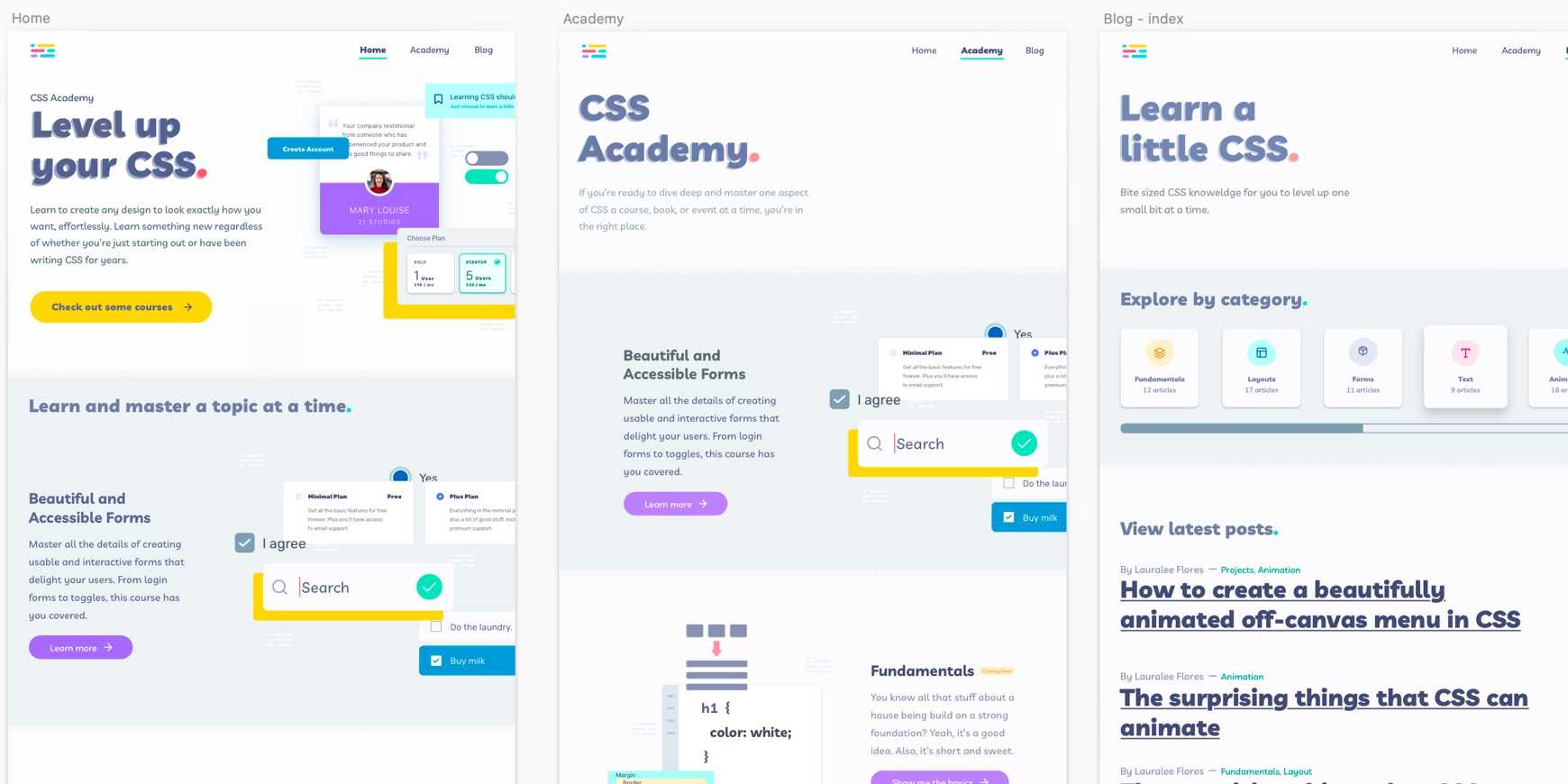
So, I started with a design of the home page:

You can see there are elements of this design that I incorporated into the current design of CSS Academy (the footer, for instance).
I let this design sit for a while - almost a whole year - before I came back to it.
During this time I thought a lot about CSS Academy. I tried to break myself free from the current way of teaching CSS. My vision for CSS Academy slowly changed over time.
I held myself back for a while. Partly out of fear, imposter syndrome, and also the enormity of the project.
I started taking CSS Academy seriously
In January of 2020 I made a decision to jump into CSS Academy and do my best with it. From that point on until now I’ve been working full time on it.
There have been a few hiccups and delays. Coronavirus hit, as you know. This meant that my kids were home from school. I loved seeing them more but they also needed me a lot more than they did before.
As someone who works remotely from home, summer is always my least productive time of the year. This is usually because my kids are home. Which I love. But, again, from a productivity standpoint, it seems as if 2020 has basically been a very long summer.
Regardless, I am determined to turn CSS Academy into a business that supports me and allows me to continue to work on it. So, early on I decided to do things differently than I had in the past.
Instead of jumping right in and building the website, like I would have done in the past, I laid the ground work. I did the research. I started gathering my tribe.
My first big mistake
About six months into the project I had started working on partnering with others. But, as of yet, I didn’t have a website. Until this point, it really hadn’t slowed me down significantly.
This was a mistake. I should have been building the site months earlier. I should have been creating content from about the third or fourth month. Because by that time I had conducted a ton of research on what CSS content people were consuming and where I should focus.
Isn’t there a quote about the best time to do something was a month or a year ago or something, and the second best time is today?
When I realized my mistake I did that. I didn't dwell. I jumped right into action.
It was a Thursday when it hit me that I needed a website months ago. I decided immediately that the next week I was going to design and create CSS Academy in a week.
Determining the technology stack
I hadn’t decided how exactly I was going to build the site. I needed something that would be fast to build. By Friday, I had narrowed it down to:
- Eleventy
- Gatsby
- Ruby on Rails
I ended up removing Eleventy because I had the least amount of experience with it and I needed to build CSS Academy fast.
It was a really hard choice but I ended up choosing Gatsby over Ruby on Rails.
It all came down to Gatsby being a static site. You simply can't beat the security and speed of a static site.
I have a lot more experience with Rails and that led me to almost go that route. My last two side projects were built on Rails. I love the Ruby programming language.
And so, yes, I may regret this choice at some point but had to make a decision.
Just to be clear, I’m not saying that of the three Gatsby is the best choice. In my specific situation it seemed to make the most sense.
The last thing I did Friday, after making the decision to go with Gatsby, was to determine what I needed to do each day in order to have the website built in one week.
This one week delay to build the website already put me a week or more behind with two of my partners. So, I was feeling very motivated to get the site done in one week.
As I worked through the schedule I realized I had one day to design all the pages for CSS Academy.
Designing the site in one day
A lot of design decisions had already been made so I saved a lot of time not having to determine colors, a logo, and font family choices.
I also incorporated a number of design decisions from my designs the previous year, saving me additional time.
There were two aspects about the design that took me the longest:
- The pages to design - how the site would be structured.
- The graphics - the visuals that illustrate what things you’ll learn to style inside CSS Academy.
I didn’t quite finish everything by Monday night, but I did have all the designs done before 8am Tuesday morning.

I won’t go through the details of what I did each day but by Friday I had created the website, including the blog, or so I thought.
But more on that in a minute.
First, let me walk you through some of my choices in the way I built CSS Academy.
Bare bones website
I built the site in Gatsby.
I used the gatsby-starter-hello-world theme.
This is basically a gatsby theme with nothing in it. Which, is exactly what I wanted. I didn't want to mess around trying to customize a theme.
Looking back now I might have saved some time finding a theme with everything I wanted.
With that said, I'm happy with the direction I went. I have no bloat - no plugins I'm not using. And I built it the way that makes the most sense to me.
Page structure
The pages were built using primarily hooks and components. Let me give you an example by showing you some of the code for the home page:
jsx1const Home = () => {2 const { lastthree } = usePosts()34 return (5 <>6 <SEO title="Home" />7 <Layout>8 <Hero />9 <FeaturedCourse />10 <ContentWrapper>11 <Posts posts={lastthree.posts} title="Learn bits at a time" />12 <CTA>13 <Button primary={false} link={"/blog/"} title={"View Blog"} />14 </CTA>15 </ContentWrapper>16 <CallToAction />17 </Layout>18 </>19 )20}
I don’t have a lot of pages at this point, but they all follow the same component driven structure. This will make it easier and faster for me in the future to make any updates and changes to my pages.
Images in general and specifically in Gatsby
Images are a huge topic in web development. In fact, I’m sure I’ll be creating an images course on CSS Academy sometime in the future.
When displaying images on your website, you need to ensure they’re not slowing down the page load times on your site. This involves a number of different approaches - including properly determining the image type, minifying the images, and then styling them correctly.
Gatsby takes some of the pain out of this process with a plugin called Gatsby Remark Images, which is what I used.
Once I had pages and images in place I started quickly designing a component at a time.
Since you, like me, are probably interested in CSS, let’s dive into how I am styling everything. 😄
Styling
When a website is new and small it’s easy to add and adjust styles. You don’t have to worry what one style change will do to the rest of the website.
However, as a website grows, it is not uncommon to have so many styles in place that a few things might happen:
- It’s hard to find the correct styles or they are all over the place and you have to track down each one.
- In order to make adjustments you have to override existing styles. This might include being unnecessarily specific, or including
!importanton each style, and other bad practices. - You want to update some styles but you’re scared what that one change will impact unintentionally. Because as it turns out you’re not sure where that style is being used throughout your site and so a minor change could break other things unexpectedly.
I’ve run into this myself personally. I’ve learned from the experience.
Here’s how I manage my CSS so I don’t run into any of those issues. Or if I start to, I can easily fix them.
Component based styles
First, I keep all my styles for the component within that component.
There’s more to it than this, however this is one of the key fundamentals of not letting my styles get out of control. They’re nicely contained and not globally disseminated.
Styled Components
In order to get the website completed within the week I went with another of my personal preferences, which is styled components. It’s a CSS-in-JS approach and there are a lot of people who have strong opinions on this topic.
I’m not here to argue either side, I just want to be as transparent as possible. I really thought about which approach I would take and styled components made the most sense based on my goals and experience.
Let me walk you through one component so you have a practical example of what this looks like on CSS Academy.
Here is the entire component for the footer - including all the styles and everything:
jsx1import React from "react"2import styled from "styled-components"3import { Link } from "gatsby"4import Logo from "../components/Logo"5import {6 navy,7 neutral,8 yellow,9 typeScale,10 transition,11 width,12 perfectFourth,13} from "../utils/"1415const Footer = () => {16 return (17 <PageFooter>18 <InnerFooter>19 <SVGWrapper>20 <Link to="/">21 <Logo />22 </Link>23 </SVGWrapper>24 <FooterText>25 Designed and created by{" "}26 <a href="https://www.lauraleeflores.com">Lauralee Flores</a>.27 <br /> Built on GatsbyJS. Hosted on Netlify. © {new Date().getFullYear()}28 </FooterText>29 </InnerFooter>30 </PageFooter>31 )32}3334const PageFooter = styled.footer`35 background: ${navy[500]};36 margin-top: ${perfectFourth[600]};37 margin-block-start: ${perfectFourth[600]};38`3940const InnerFooter = styled.div`41 max-inline-size: ${width.reg};42 margin-inline-start: auto;43 margin-inline-end: auto;44 padding: ${perfectFourth[400]} ${perfectFourth[200]};45 padding-block-start: ${perfectFourth[400]};46 padding-block-end: ${perfectFourth[200]};47 display: flex;48`49const SVGWrapper = styled.div`50 width: 15%;51 display: flex;52 align-items: center;53`5455const FooterText = styled.p`56 color: ${neutral[100]};57 text-align: right;58 float: right;59 width: 85%;60 font-size: ${typeScale.smallText};61 a {62 text-decoration-color: ${yellow[500]};63 transition: ${transition.reg};64 &:hover {65 color: ${yellow[500]};66 }67 }68`6970export default Footer
Let’s break down the styles here.
First, I want to draw your attention to the styled components. On line 34 you’ll see the styles for the first styled component: the PageFooter. On line 17 you’ll see that’s where I use it in the footer component. It is a footer tag with a background and margin-top or margin-block-start property.
If you’re not sure what the margin-block-start property is check out this complete guide on Logical Properties that will walk you through learning and mastering it.
Now, you may be scratching your head at some of these styles. For instance, you might see that the value for the background properties is ${navy[500]}. What is that?
That, my dear reader, is the second key fundamental aspect of my styling approach in order to not let my styles get out of control.
Base Styles
There are certain styles in any website design that are repeated over and over: font size, color, spacing between elements, etc.
Those base styles should be written once and used when needed in each component.
And if you ever need to make any modifications, you can do it in one place - directly to the base styles.
So, let’s walk through some of my base styles.
First, I have them all grouped together in a nice utils folder.
Whenever I need to use one of these styles in a component, I simply import the individual style in.
If, for example, I need the navy color. I just import navy into the component.
Let’s look at what base styles I’m using in the Footer example above.
Starting on line 5 through 13 you can see all the base styles I’m importing into the Footer component.
The first two are navy and neutral.
Inside my utils folder where I keep all my base styles I have a file that has all the colors, including the navy and neutral colors. This is what those look like:
jsx1export const neutral = {2 100: "hsl(210, 17%, 99%)",3 200: "hsl(210, 25%, 95%)",4 300: "hsl(208, 25%, 86%)",5 400: "hsl(208, 24%, 80%)",6 500: "hsl(208, 24%, 74%)",7 600: "hsl(207, 19%, 61%)",8 700: "hsl(206, 14%, 41%)",9 800: "hsl(202, 11%, 29%)",10 900: "hsl(203, 7%, 20%)",11}1213export const navy = {14 100: "hsl(229, 50%, 98%)",15 200: "hsl(229, 50%, 93%)",16 300: "hsl(229, 18%, 68%)",17 400: "hsl(229, 18%, 61%)",18 500: "hsl(229, 18%, 45%)",19 600: "hsl(229, 24%, 35%)",20 700: "hsl(229, 28%, 25%)",21 800: "hsl(229, 30%, 22%)",22}
This gives me access to all my neutral colors and navy colors with 100 being the lightest and 800 or 900 being the darkest.
Do you remember the color palette from earlier?
So, just by importing the name of the color I quickly and easily have access to every color I might need while not adding any bloat to my styles. It also allows me to keep everything DRY.
As you might have guessed, I’m using a perfect fourth type scale for both font sizes and spacing (both vertical and horizontal).
Ultimately these base styles will allow me to maintain a level of consistency across the website. Instead of adding a pixel or two of space between the text and the button I am constrained to this pre-determined design system.
This constraint is good.
Speaking from a strictly design perspective the consistency that comes from this constraint make for a much cleaner and more polished design.
Global Styles
In addition to my base styles, I also have a global style sheet inside my utils folder.
This global style sheet uses a number of base styles. These global styles are placed on my layout template that is used on every page of my website.
It includes:
- my own reset styles
- some general global styles that I apply to the root, body, scrollbar, etc.
Would you like to access the styles (inluding my global stylesheet) in my utils folder, exactly as they appear on CSS Academy? If so you can download the utils folder with all the base styles here.
More than SEO
SEO, or search engine optimization, is important.
So, naturally, this was one of the things I worked on during this week.
But, it wasn’t just about optimizing the site for search.
When someone finds CSS Academy via the search engines I wanted the information to be accurate and helpful in determining if the content was right for them.
I also wanted to make sure that if someone shared a post or page on the website on social media or through a messaging app like Slack that it looked good there too. I wanted it to show an image along with a title and subtitle.
To do this I created one central seo.js component. A couple key aspects of this component are:
- I imported the site metadata and used that as a default in case an individual page or post didn’t have its own information.
- I used React Helmet to show the metadata.
- I used the open graph and twitter meta properties to show title, description, and image for the page.
Within each page (home, academy, blog, etc.) I import this SEO component and indicate any custom information for that page. The most interesting example is a blog post.
The blog post template looks like this:
jsx1...2import SEO from "../components/seo"3...4const postTemplate = ({ data }) => {5 const {6 mdx: {7 frontmatter: { title, author, summary, image },8 body,9 },10 } = data11 return (12 <>13 <SEO14 title={title}15 author={author}16 description={summary}17 image={image.childImageSharp.fluid.src}18 />19 ...20 </>21 )22}
And within an individual blog post, like this one, I assign that information in the frontmatter of the post.
For this blog post the front matter looks like this:
mdx1---2title: The details of how CSS Academy was created3slug: how-css-academy-was-created4summary: Learn the details of how CSS Academy was designed and created and why those decisions were made. Also, get a glimpse into exactly how the site was built.5image: ./images/css-academy.jpg6author: Lauralee Flores7category: ["projects"]8date: 2020-08-209---
You might be wondering about the image.childImageSharp.fluid.src on line 17 of the blog post template. I’m getting that from the blog post frontmatter on line 5. I’m using the Gatsby Remark Images plugin to display the image in a performant way.
With all this together I have a custom title, summary, and image for every page, including the blog posts. So, people can find relevant information and if shared on social media it’ll also look good.
The last remaining item for this one week sprint was to create the blog.
The surprising challenges creating the blog
The blog posts are written in mdx files. This allows me to add react components and write JSX inside a markdown file. A blog post might look like this:
mdx1<div className="content-wrapper flow">23#### My sweet h4 headline45Here's a link to [CSS Academy](https://www.cssacademy.com/).67</div>89<div class="image-wrapper">10111213</div>1415<div className="content-wrapper flow">1617Click the button below to say hi to me:1819<WaveHiComponent />2021</div>
And that would look like this:
My sweet h4 headline
Here's a link to CSS Academy.
Click the button below to say hi to me:
That simple Wave Hi Component looks like this:
jsx1import React, { useState } from "react"2import styled from "styled-components"3import { purple, borderRadius, transition } from "../../utils"45const WaveHiComponent = () => {6 const [waves, setWaves] = useState(0)7 const label = `👋 ${waves} ${waves === 1 ? "wave" : "waves"}`8 return <Wave onClick={() => setWaves(waves + 1)}>{label}</Wave>9}1011const Wave = styled.button`12 background: ${purple[700]};13 border-radius: ${borderRadius.reg};14 color: white;15 font-size: 1.25rem;16 padding: 0.25rem 1rem;17 border: none;18 transition: ${transition.reg};19 &:hover {20 background: ${purple[800]};21 cursor: pointer;22 }23`2425export default WaveHiComponent
And I simply imported that component into this blog post.
So, what were these challenges?
I got the blog together, for the most part, at the end of the week.
I had some blog posts written but hadn’t yet added them to the site. I had just used dummy data and images to ensure I had the bare bones set up.
I figured that whatever styles I would need to add that I could do those quickly as I added in the blog posts.
On Monday morning, I was feeling pretty good about meeting my goals the previous week. That was, until I started adding in the first blog post.
It was really soon that I realized that I had severely underestimated the amount of changes I would need to make in order to get the blog up and running.
I had to change some frontmatter items, the graphql query, the blog template layout. And a lot of styles.
I also realized that there were some components I needed to build for the blog.
And then there were the responsive styles that I had overlooked the previous week that needed to be fixed. And some pages that needed parts to be refactored into components that I had missed due to my rush the previous week.
All-in-all it took me an entire week to fix these things up.
Even though it took me a week longer than I had hoped and planned for, I still feel like I did it faster than I would have if I hadn’t time blocked myself.
It is reminder of Parkinson’s law - the old adage that work expands to fill the time allotted.
If I had given myself one week to design the website I think it would have taken that long. But, I only gave myself one day. And I somehow got it done in that day.
My stumbling with the blog also reminded me that I shouldn’t design or create websites or web applications with dummy text.
I should have used a real blog post. The way I created the blog template and decisions I made would have been slightly different.
Once I put in the blog post I had to go back and fix and change those decisions which cost me a little more time.
With all that said, I’m still happy I created the website so quickly.
Roadmap looking forward
As with any website, it’s never done. I think this is especially true for us web developers.
I have some definite plans and a roadmap for improvements for CSS Academy.
I’m setting aside a little bit of time each day to do these improvements. So, you’ll gradually be seeing these roll out over the next few weeks.
Here are a few of the things I’m working on (not necessarily in order):
- ✅
Updating the font sizes to be fluid depending on the size of the screen. - ✅
Adding a breadcrumb trail for pages that are 3 levels deep. - ✅
Refactor some specific components and pages - ✅
Create a blog component similar to CodePen but since I’m going to be showing a lot of CSS, I want it worked straight into the blog post without needing to embed a bunch of CodePens. This will allow you to play with the CSS and see the results right from the blog post.I got help with this from Dave Ceddia - an awesome React developer. If you want to learn React, you should check out some of the great resources he offers. - Some style updates. Specifically I’m going to look through my hover, focus, and active states. As well as my text legibility.
- [In Progress] Create the 404 page that I designed in that week but didn’t get to yet.
- Figure out a way to turn the frontmatter summary into markdown or mdx. I already spend half a day trying to do this and it was incredibly frustrating. I need to come back to this and try to figure it out.
- Make CSS Academy a progressive web app.
- Add relevant posts at the end of each blog post with a link to that information.