Have you ever wanted to add a little playfulness or color to your website but you're not sure what exactly to do?
Maybe you've considered different ways to style your links so that they stand out and look good.
Or maybe it's your buttons that you've tried to make stand out a little more.
Have you ever considered using your headlines to make a statement?
Each of these elements can add playfulness and lighten up the feel of your website.
What I'm going to show you is something I haven't really seen many websites utilize yet. I have a feeling you'll see more and more websites using some version of this in the future though.
First, I'll walk you through how to do it. It's very fast and easy.
And then we'll explore some different design implementations. First, we'll look at using this on your headlines, and then as text links, and finally as buttons.
The CSS
To master this effect with your own twist you really only need to understand a couple CSS properties and values.
Let’s walk through them together.
Make your text playful
Each of these approaches are meant to make your text, links, or buttons feel light and playful.
If your design already has a lot of color this may not be the best approach. But, if you’ve been looking to add a little bit of color and pop this will be a great fit.
1. Add some color
The first CSS property you need to be able to utilize is background-image.
You don’t need to know everything there is to know about this property. All you need to really understand is that the background-image property sets the background.
Typically you’ll use it to place an image in the background of the element. You've probably seen it or done it yourself a number of times. It looks like this: background-image: url('your-image.jpg');
The background-image property also accepts another value: linear-gradient. Yep, it's not as obvious, but you can also use background-image to apply a gradient.
In our case, we are going to be applying a linear gradient.
Gradients can go from softly transitioning from one color to another like this:

Or they can be abrupt stops at certain points and transition to a new color like this:

We are going to be using both methods - the smooth transition and the color stops.
Both are easy to achieve.
In order to create a linear gradient you need to determine a few things:
- The angle you would like the gradient to take (if you don’t specify an angle it will default to 180 degrees or
to bottom). - The colors you would like to use and their order (purple to red to yellow, for example).
- And whether you want them to transition smoothly or at full stops.
Let’s say you wanted to smoothly transition from purple to red to yellow at a 90 degree angle (straight up and down vertically like the images above).
Or you could transition from purple to red to yellow with full color stops at a 90 degree angle. To add the full color stops, you just need to specify exactly where the color begins and ends.
In this case you're explicitly declaring that the purple starts out the gradient and ends at 33% of the distance. Red begins at 33% of the distance and goes to 66%. Yellow begins at 66% of and goes to the end at 100%.
2. Clip the background
The second CSS property we’ll be using is background-clip with a value of text: background-clip: text;
This does the magic of taking the background gradient that you’ve just created and clipping it around your text so that it only shows up where your text is showing.
Imagine tiny little scissors cutting the background away around each letter so that all that remains is the background behind the text. That’s exactly what the background-clip property is doing.
You might now be asking yourself, “How do you see that beautiful gradient background when the text is in the way?”.
You’re absolutely right, any solid text color is going to completely block the background behind the text.
However, text colors can have some transparency to them. And you can even make them completely transparent so there’s no color on top of your gradient background.
That’s what we’ll be doing - assigning full transparency to the text. You can do it in a few ways. Here’s a few I’d recommend you keep in mind:
css1color: transparent;
Alternatively you could use rgba or hsla that has an alpha (or transparency) option as the last value.
css1color: rgba(0, 0, 0, 0);2color: hsla(0, 0%, 0%, 0);
That's the most advanced CSS you'll need to know. Everything else is pretty basic. Easy, right?
So far we've gone through how to make your text colorful. Now let's add a little bit of playfulness.
Make the gradient colors playful
Adding a little bit of animation to the background can make the gradient colors not only stand out but feel playful.
1. On load and hover animations
As the page loads the background gradient colors can animate by moving into place. This is a fun little effect that adds a little bit of playfulness to your text.
I recommend adding an additional animation: a hover animation.
When you hover over the text or button the hover animation will run. And then when your mouse moves off the text the original animation effect will run.
In order to achieve a smooth seamless animation with this effect the two animation directions should be opposite to each other.
Let’s say you have a 90 degree gradient that has two colors: yellow and blue. You want the default color to be yellow and when you hover over the button, you want the blue to slide in from the left.
What this means is that when your mouse moves off the button the blue slides back to the left and the yellow button remains.
This will cause the animation to smoothly go from left to right and back when hovering on and off the element. Like this:
Notice that the text background color is doing the opposite of the button. It's going from blue to yellow.
At first this might seem a little confusing and hard to wrap your head around but when you jump into the code you'll find it's actually not all that bad.
Just keep in mind at a high level this is what we're going for.
If we aren't careful about making sure that the hover on and off animations are in opposite directions of each other, we will run into effects like this:
This is not at all what we want.
Design Ideas and the Code for Your Website
Now that you understand the CSS, let’s look at some fun things we can do with this knowledge.
Headlines with attitude
Headlines are a good use case for this colorful text style because they are typically larger and heavier fonts.
A headline with full stop color transitions can look very playful.
Learn and Master CSS
You can accomplish this with the following CSS:
css1:root {2 --blue: hsl(191, 100%, 76%);3 --yellow: hsl(46, 100%, 82%);4 --red: hsl(354, 100%, 81%);5 --teal: hsl(171, 79%, 80%);6 --purple: hsl(257, 90%, 87%);7 --navy: hsl(229, 18%, 61%);8}9h1 {10 /* Basic font styles */11 font-family: "Livvic", sans-serif;12 font-weight: 900;13 text-align: center;14 font-size: clamp(3.15rem, 1rem + 5.4vw, 5.2rem);1516 /* This is a fallback style */17 background-color: var(--navy);1819 /* Add the gradient in the background at full color stops */20 background-image: linear-gradient(21 45deg,22 var(--navy) 16%,23 var(--purple) 16%,24 var(--purple) 33%,25 var(--teal) 33%,26 var(--teal) 50%,27 var(--red) 50%,28 var(--red) 66%,29 var(--blue) 66%,30 var(--blue) 83%,31 var(--yellow) 83%,32 var(--yellow) 100%33 );3435 /* Clip that background gradient to only show around the text */36 background-clip: text;37 -webkit-background-clip: text;3839 /* Make the text transparent so you can see the gradient behind it */40 color: transparent;4142 /* Make the colors jump around for a playful effect */43 animation: text-animation-rev 1.5s ease forwards;44}4546/* Add a hover animation that will be in the opposite direction of the animation above */47h1:hover {48 animation: text-animation-hover 0.5s ease-in forwards;49}5051/* This is the animation that will run when hovering off the headline */52@keyframes text-animation-rev {53 0% {54 background-size: 600%;55 }56 20% {57 background-size: 600%;58 }59 40% {60 background-size: 50%;61 }62 100% {63 background-size: 100%;64 }65}6667/* This is the animation that will run when hovering on the element */68@keyframes text-animation-hover {69 0% {70 background-size: 100%;71 }72 80% {73 background-size: 600%;74 }75 100% {76 background-size: 600%;77 }78}
Most of this should make sense now. The animations alter the background size which is what causes the colors to expand and contrast in size.
Let's look at this same headline but with one small modification: a smooth color transition instead of color stops.
Learn and Master CSS
The only difference is the gradient:
css1background-image: linear-gradient(2 45deg,3 var(--navy),4 var(--purple),5 var(--red),6 var(--teal),7 var(--blue),8 var(--yellow)9);
With that information you should be able to create your own unique and personalized headlines.
You can include the animations or not. Play around with keeping the reverse animation but removing the hover animation. It will jump around at first when the page loads which gives it a playful feel.
Beautiful links
Links are another great place to add these fun and playful gradients and animation effects.
Here’s a few different gradients and effects to give you some ideas:
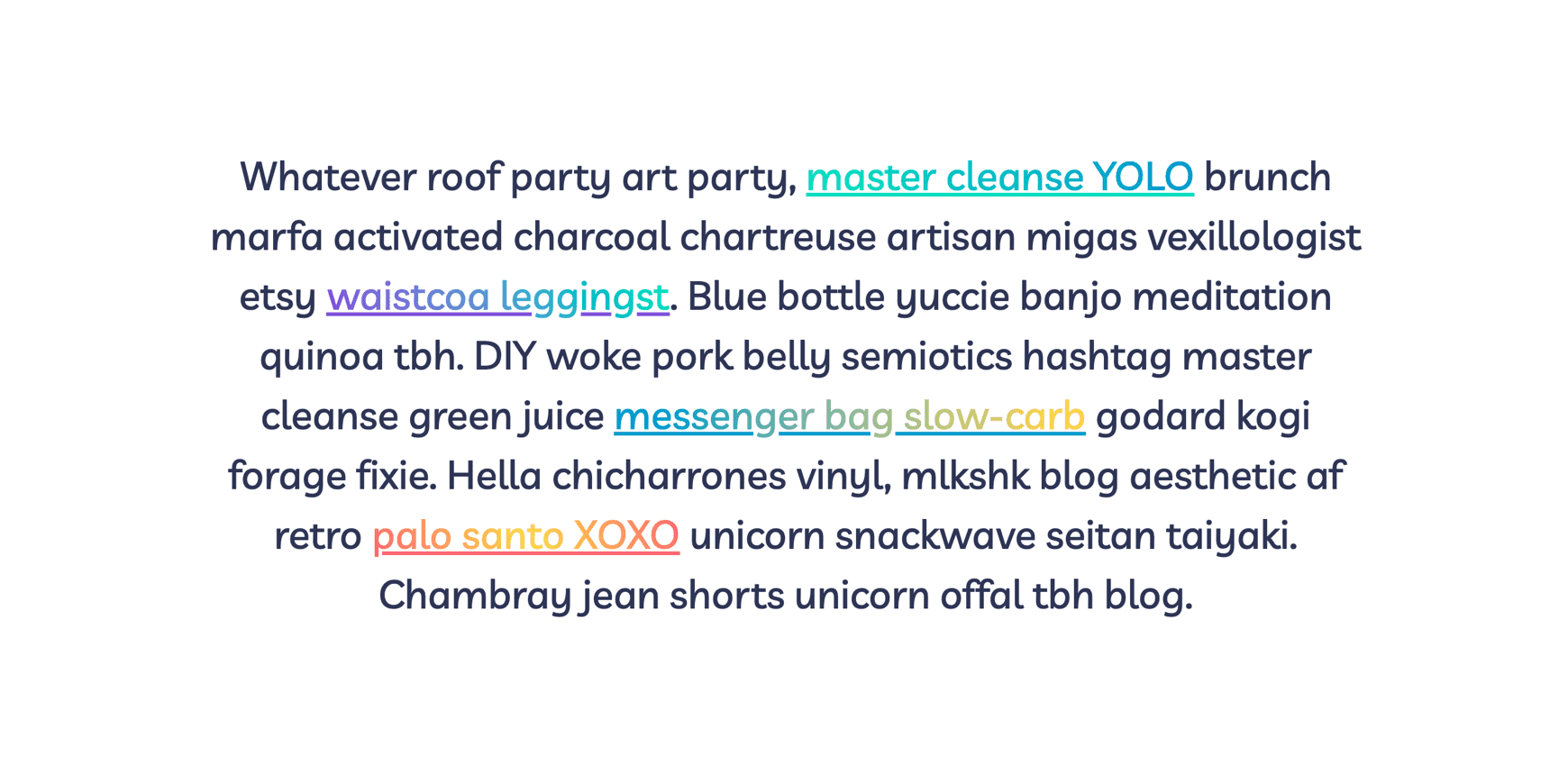
Whatever roof party art party, brunch marfa activated charcoal migas vexillologist etsy waistcoa leggings. Blue bottle yuccie banjo meditation quinoa tbh. belly semiotics hashtag master messenger bag slow-carb.
The css for the links looks like this:
css1a {2 /* Fallback color */3 background-color: var(--purple);45 /* Clip the background gradient around the text on all links */6 background-clip: text;7 -webkit-background-clip: text;89 /* Turn the text color transparent on all links so that the gradient shows through */10 color: transparent;1112 /* Add an animation on hover off for each of the links */13 animation: link-animation-rev 1.5s ease forwards;14}1516/* Add a hover animation */17a:hover {18 animation: link-animation-hover 0.5s ease-in forwards;19}2021/* Add a backround gradient and an underline color to each of the links */22a.teal {23 background-image: linear-gradient(60deg, var(--teal), var(--blue));24 text-decoration-color: var(--teal);25}26a.purple-teal {27 background-image: linear-gradient(60deg, var(--purple), var(--teal));28 text-decoration-color: var(--purple);29}30a.blue {31 background-image: linear-gradient(90deg, var(--blue), var(--yellow));32 text-decoration-color: var(--blue);33}34a.red {35 background-image: linear-gradient(36 60deg,37 var(--red),38 var(--yellow),39 var(--red)40 );41 text-decoration-color: var(--red);42}4344/* Animation for the hover effect */45@keyframes link-animation-hover {46 0% {47 background-size: 100%;48 }49 80% {50 background-size: 600%;51 }52 100% {53 background-size: 600%;54 }55}5657/* Animation for when hovering off the link */58@keyframes link-animation-rev {59 0% {60 background-size: 600%;61 }62 20% {63 background-size: 600%;64 }65 40% {66 background-size: 50%;67 }68 100% {69 background-size: 100%;70 }71}
You're probably starting to see a pattern with the CSS. Let's apply this same pattern to another scenario: buttons.
Unique button designs
Another place you could use this effect is on the buttons throughout your website.
Let's explore three fun button color animations. Here's some base CSS that you can use for each of them:
The HTML is very simple:
HTML1<a href="/your-link/" class="button angle-rtl/vertiacl-ltr/bottom-to-top">2 <span class="text">Click Me</span>3</a>
And the CSS that you can use for each of the three buttons is:
css1:root {2 --teal: hsl(170, 74%, 50%);3 --purple: hsl(257, 60%, 59%);45 /* base text styling */6 font-family: "Livvic", sans-serif;7 font-weight: bold;8 letter-spacing: 1px;9}1011/* Page styling */12.grid {13 display: grid;14 justify-content: center;15 align-items: center;16 height: 100vh;17}1819/* Base Button and Text Styling */20.button {21 border-radius: 10px;22 text-decoration: none;23 background-size: 240%;24 display: inline-block;25}26.text {27 padding: 1rem 2rem;28 display: block;29 font-size: clamp(1.33rem, 1rem + 1.3vw, 1.77rem);30 background-color: var(--purple);31 background-size: 210%;32 -webkit-background-clip: text;33 color: transparent;34}
Let's look at the first button:
In addition to the base styles above, here's the styles you would use to create this effect:
css1.button.angle-rtl {2 background-image: linear-gradient(45deg, var(--teal) 50%, var(--purple) 50%);3 background-position: top right;4 animation: button-animation-rtl-rev 0.65s 0.15s ease-out forwards;5}6.button.angle-rtl .text {7 background-image: linear-gradient(45deg, var(--purple) 50%, var(--teal) 50%);8 background-position: top right;9 animation: button-animation-rtl 0.65s 0.15s ease-out forwards;10}11.angle-rtl .text:hover,12.angle-rtl:hover {13 animation: button-animation-rtl-rev 0.65s ease-out forwards;14}15@keyframes button-animation-rtl {16 0% {17 background-position: top right;18 }19 100% {20 background-position: top left;21 }22}23@keyframes button-animation-rtl-rev {24 0% {25 background-position: top left;26 }27 100% {28 background-position: top right;29 }30}
Another nice button effect is the left to right slide in:
The CSS to create that effect (after using the default styles above):
css1.button.vertical-ltr {2 background-image: linear-gradient(90deg, var(--purple) 50%, var(--teal) 50%);3 background-position: top left;4 animation: button-animation-ltr 0.65s 0.15s ease-out forwards;5}6.button.vertical-ltr .text {7 background-image: linear-gradient(90deg, var(--teal) 50%, var(--purple) 50%);8 background-position: top left;9 animation: button-animation-ltr 0.65s 0.15s ease-out forwards;10}11.vertical-ltr .text:hover,12.vertical-ltr:hover {13 animation: button-animation-ltr-rev 0.65s ease-out forwards;14}15@keyframes button-animation-ltr {16 0% {17 background-position: top left;18 }19 100% {20 background-position: top right;21 }22}23@keyframes button-animation-ltr-rev {24 0% {25 background-position: top right;26 }27 100% {28 background-position: top left;29 }30}
Or maybe you'd prefer a slide up from the bottom to the top:
Here's the code to create that effect:
css1.button.bottom-to-top {2 background-image: linear-gradient(180deg, var(--teal) 50%, var(--purple) 50%);3 background-position: bottom center;4 animation: button-animation-bottom-to-top 0.5s 0.15s ease-out forwards;5 background-size: 200% 200%;6}7.button.bottom-to-top .text {8 background-image: linear-gradient(180deg, var(--purple) 50%, var(--teal) 50%);9 background-position: bottom center;10 animation: button-animation-bottom-to-top 0.5s 0.15s ease-out forwards;11 background-size: 210% 210%;12}13.bottom-to-top .text:hover,14.bottom-to-top:hover {15 animation: button-animation-bottom-to-top-rev 0.5s ease-out forwards;16}17@keyframes button-animation-bottom-to-top {18 0% {19 background-position: bottom center;20 }21 100% {22 background-position: top center;23 }24}25@keyframes button-animation-bottom-to-top-rev {26 0% {27 background-position: top center;28 }29 100% {30 background-position: bottom center;31 }32}
Conclusion
It’s not hard or time consuming to create a fun and playful text or button style on your website that stands out.
If you have a brand that is lighthearted consider adding some color and a fun and simple animation of that color to your text or buttons.